My Vintage Dining Room as it looks today, including my thoughts on dining room lighting, dining room decor and more.
Most spaces within my house are at the point where they are being tweaked but not overhauled. There's something liberating about further curating a space and not designing from the ground up. The design process when you are starting from scratch, thinking about what flooring to install, what color to paint the walls, opening up a wall to create a larger footprint, etc.; those are the questions that I'm past when it comes to the dining room.
I'm on to fun changes, new tweaks, more thinking about what is going to work longterm, etc. I first transformed the dining room to a space I felt comfortable with back in 2016. I revealed the new look with the wallpaper, vintage rug and more. Honestly, I really liked it. See the Eclectic, Mid-Century Dining Room reveal if you want to check out what my style looked like four years ago.
As I've gotten older (and wiser), I've learned to not just decorate with tons of plants, to not JUST shop mass production items and to not skimp on quality pieces that I love. Honestly, it's taken a few years to further curate my style, but I'm definitely enjoying where I'm at right now. Over the past few years a few things here and there have changed in the space so, I thought today was a perfect day to share the progress of my Vintage Dining Room.
I'm not calling the dining room "done" because, as you will see, there's a fun, sentimental project that I still want to do and potentially add in something I've wanted for years. But, the space feels well-balanced. It feels curated. It feels intentional and I definitely want to show you what I'm loving about it today.
Vintage Dining Room
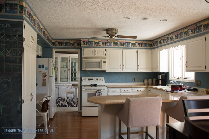
From day one, I had to think about rug and table dimensions because of our dining room layout. When we renovated the kitchen, we opened the wall up further from the kitchen to the dining room. Here's what we started with in regards to the layout:
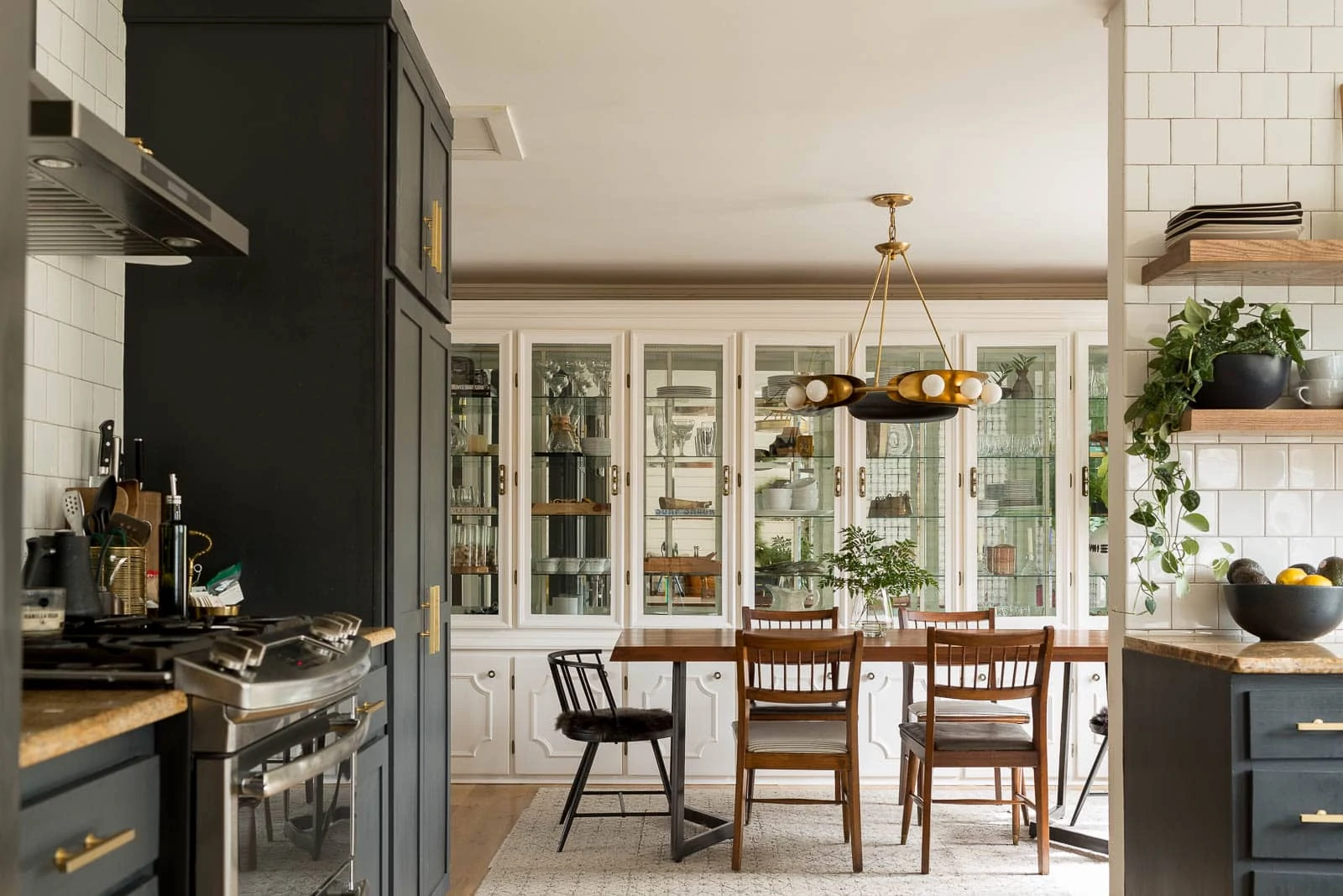
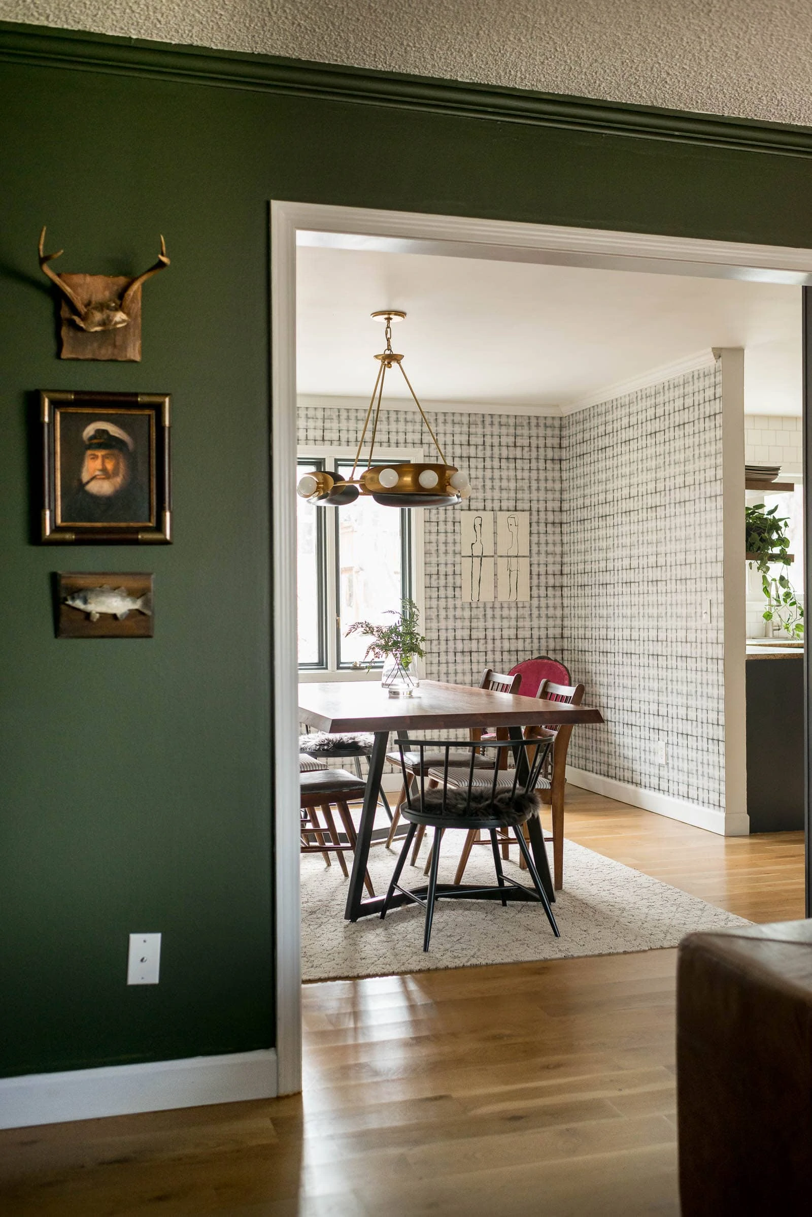
Here's the dining room layout from the kitchen now:
Not exactly the same angle, but I think you can tell how much it changed! Much better, right?! Well, when we built the kitchen cabinets, I felt like the best option for us was for us to continue to use the wall space to the dining space. It makes the two spaces feel cohesive, which is great, but it also cramps the walkway between the table and the pantry doors.
Our dining room size is 14' x 9.5'. The pantry cabinet cuts into that 9.5' width, leaving only a 7' walkway between the end of the cabinet and the built-in. Standard or average dining room sizes are all over the place depending on where your house was built and how much square footage you have. I think our dining room is a tad on the small size but is a pretty standard size minus the cabinet jutting into the space. I still feel like it was the best option for us, but I do have to account for a limited walkway in the dining room.
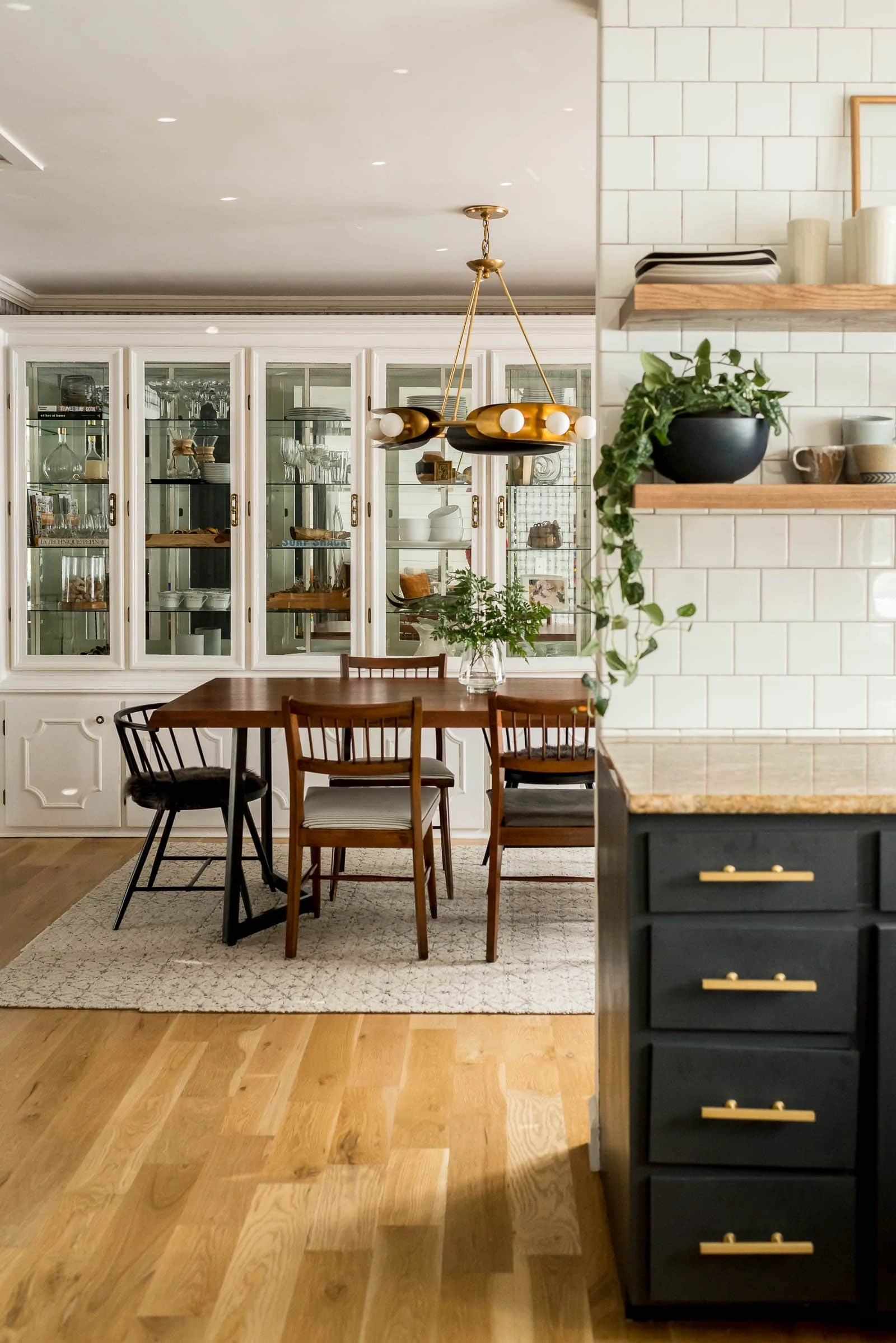
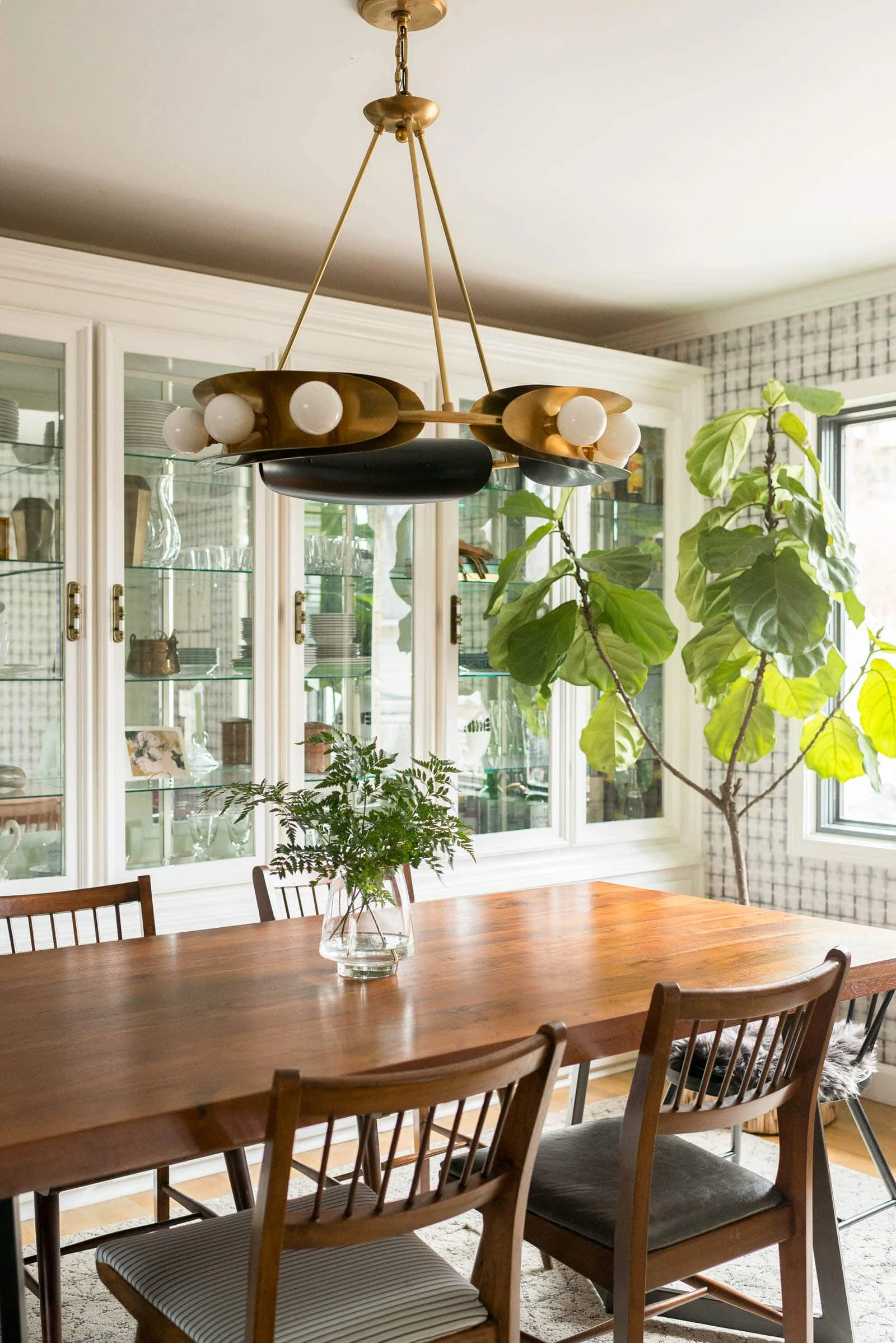
Another thing that we worked with since day one was the vintage dining room cabinet or built-in, as some would say. When we first moved in, I HATED it. I told everyone who asked me about it that I wanted to rip it out. I mean, I could see the craft that went into it as well as the storage value and just general uniqueness, but I didn't love how it looked. At this point, I'm older and wiser and realize that the wall-to-wall, built-in china cabinet adds character and it's a big part of our main floor. I think it still looks a bit dated but I like it now. It really helps give that vintage-y, high-end vibe to the space.
It also helps that I painted that whole built-in my favorite white: Ultra White by Valspar. When it was dingy cream, it REALLY looked dated.
Keeping a mix of different objects in the china cabinet also helps make it more modern. I like wood trays, cookbooks, glasses as well as some pretty textural vases. Recently, I spied a cool round-up of white ceramic vases if you are on the hunt for some.
The dining room cabinet and the wallpaper were both done back in 2016 when I revealed this space. I still really love the wallpaper and the cabinet has definitely grown a ton on me (not ripping it out, ever!). Some of the other pieces have gotten the boot or were just relocated to better locations within my house.
Let's talk about where we are today in the space, but, first off, I want to thank Corbett Lighting for sponsoring this post. They are a part of the Hudson Valley Lighting Group that I've worked with for the past year. Click to read my privacy and disclosure.
As I've improved at knowing myself and what I love, I've honestly realized that I love the yin and yang between high and low-priced products as well as the yin and yang between feminine and masculine. When I did this space a few years ago, I didn't have any masculine pieces and that really began to strike me as odd over the past year or so.
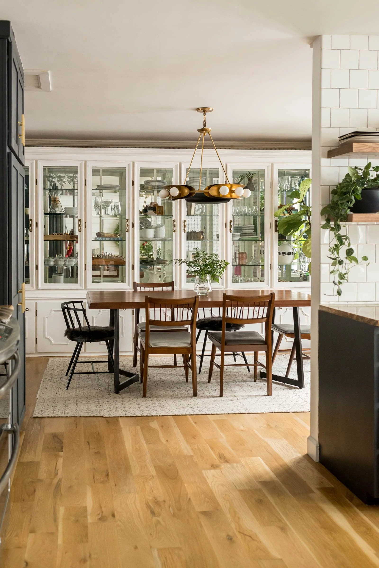
I knew I wanted a bold light to replace the light and airy light that we originally had in the space. If you know me at all, then you know that I LOVE lighting. It honestly makes or breaks a room. I like my lighting to be large and in charge too. I want to notice the lighting... I want it to catch my eye and over the past few years, I've been installing lighting in our house that does exactly that. So, the first change to this space was replacing the chandelier. I knew I wanted brass because I'm a huge lover of brass and I ideally wanted to bring in black to the space. I chose the Hopper Light by Corbett Lighting because it brought the drama in the best possible way. It mimicked the colors (not the styles) of the rest of the lighting on this floor which I felt was another yin/yang type design choice that added interest.
We aren't blessed with tall ceilings but that doesn't mean that I'm scared to go with larger light fixtures. Honestly, I love the look of a statement light fixture and think that no matter what ceiling height you have, you can still pull off a statement light fixture if you choose with care. One thing that I do like to pay attention to though is height of the fixture, meaning how far it hangs down, especially when you are placing the light fixture above a dining room table.
How High Should A Chandelier Be Above A Table?
On an 8ft ceiling, the general rule of thumb is to hang the chandelier 30-34" above the dining room table. 30" seems a tad low to me, but maybe that's just because I'm tall. I do think that 30" height creates a very cozy feel so if you were trying to create a cozy space, that might be the perfect height for you.
We hung our chandelier at 33.5" above the dining room table. I honestly just eyeballed the placement but thought to measure it for you guys!
So, what did we do besides installing the new chandelier? Well, I did a few things! First off, I've never loved how the black chairs that flanked the end of the table felt in person. They are a bit too low but I do appreciate how they don't obstruct the view from all angles. When we were in Colorado in November, I happened on this store called Hygge Life. They had sheepskin seat pads which I had never seen before. They didn't have them shown on black chairs in the store, but I knew that they would be absolutely amazing on the black chairs that I had in the dining room. I bought two and was so excited to see them work out so well in the space. They are super comfortable and I just love the instant coziness they add.
Other than that, I took out "extra" decor items/fillers that weren't working. For example, I had a vintage rug underneath the table, and although I love it... it's just too small for that space. The rug tiles that I have had for a few years now, just work better by themselves.
The dining room gets really great sunlight as it faces south, so I knew I wanted to keep a plant or two in the space. The smaller plants that I had by the window were just feeling stagnant, so I thought to move my big fiddle leaf fig in the space to see if it felt at home. I LOVE how it takes some of the interest off the china built-in and provides some of that organic, flowy texture that the space didn't have without it.
One of the things on my mind over the past few months has been our bar cart. As a parent of a tween, who has friends over all the time, I wondered if having a bar cart out was a good idea. I go back and forth about how I feel about this, so that's a conversation for another day, but I did try moving the alcohol to the built-in (it's behind the glass doors behind the fiddle leaf fig). I didn't have a use for the bar cart in the dining room after I made that switch, so I moved it out. Honestly, it's one of my favorite changes. I thought I really liked the bar cart in space and I think I did for years, but by taking it out.. it allowed me to rethink the space. There's definitely something to be said about visual clutter and negative space when it comes to design and, all of a sudden, that corner felt so much better without the bar cart.
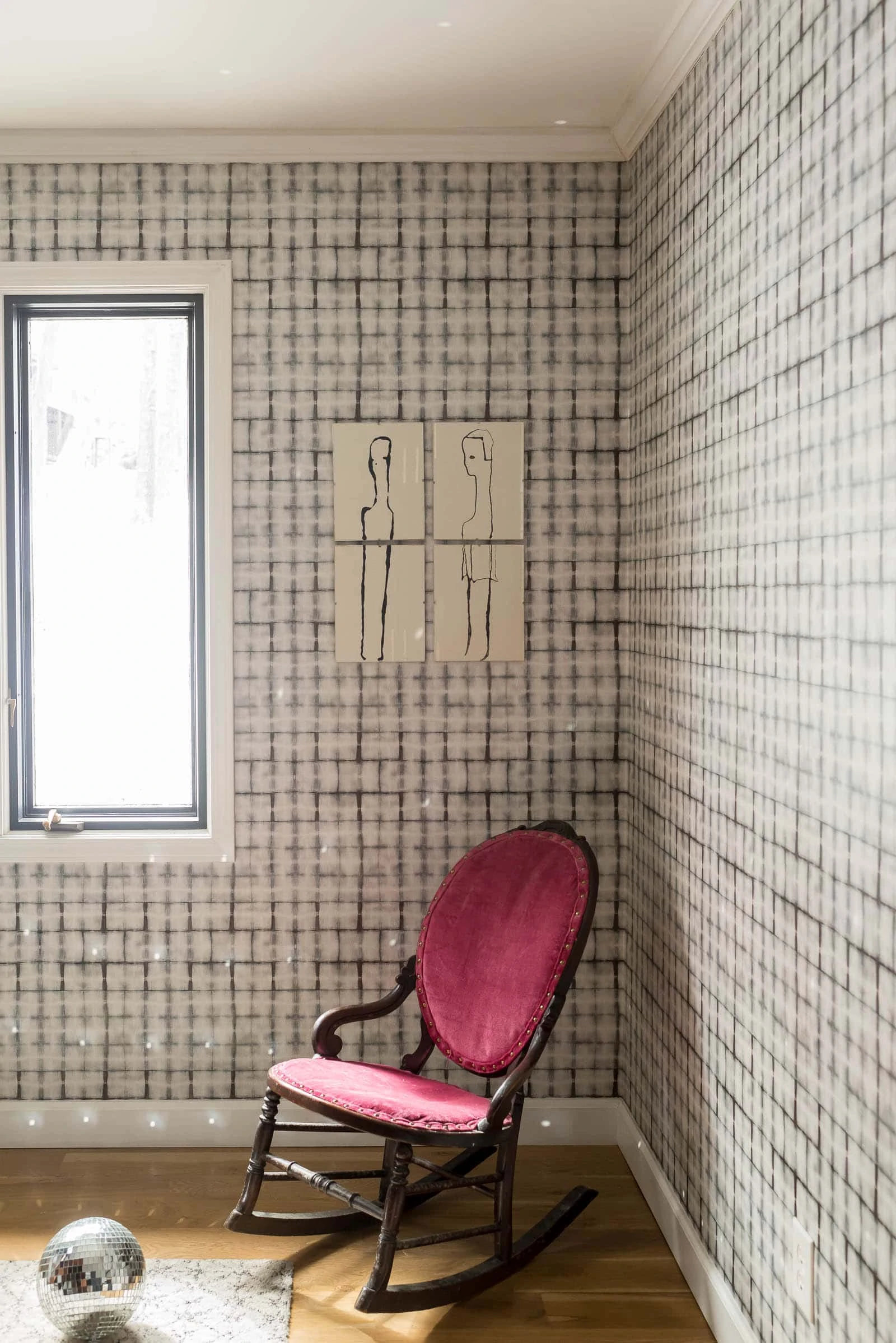
I brought in two original paintings that I purchased and I think they really shine not having anything to compete with them. They are by Rosie Winstead who is a local artist. I found them last year in a local design shop and couldn't stop thinking about them. I love how the black and white shape plays against the shibori wallpaper. It's interesting, in the best way.
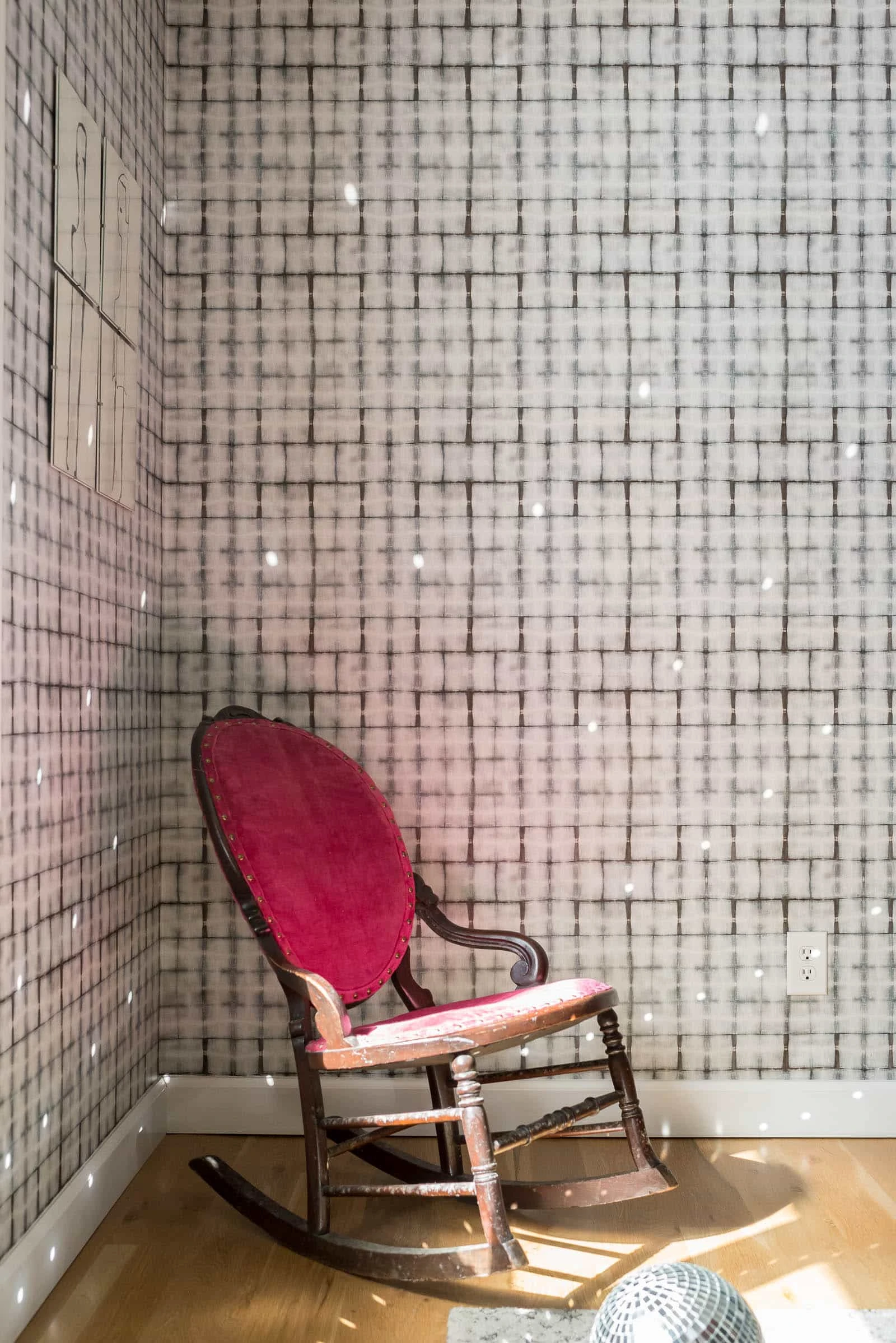
Last, but not least, the little rocker. My grandma (who passed away two years ago) gave it to me about ten years ago. I had always loved it in her house. It's petite and she called it a sewing rocker. Anyways, it has sat in my basement for years, untouched and unloved. I randomly brought it up stairs to this corner and, although I don't think it's 100% my style... it reminds me of her and I like it. I plan to have it recovered in a more modern fabric. I think it will further make the space feel more cohesive. Suzannah and I chatted about decorating with family heirlooms in a past podcast episode. Chatting together about ways to work with family heirlooms and incorporate them into our decor styles made me rethink this chair. I hadn't considered reupholstering it because the fabric is in great shape but the fabric color is what I just can't get on board with. So, is it better for this chair to sit unloved and forgotten in the basement or to be reupholstered in a fabric that I love, allowing it to be used because I have a place for it? The latter, in my opinion.
So once I get the chair reupholstered, I'll reevaluate, but I think the final step in this space will be to install a library light above the new art. I need to have an electrician out for that because we don't have wiring on that wall, but I do think I'll eventually do that. Don't you think it would add a bit of charm to that corner?
Hopper Light by Corbett Lighting
So, what do you think of my Vintage Dining Room? Are you loving it? All in all, I'm so happy with the changes that I've made to the space. I'll be sure to share when I reupholster my little sewing chair! I can't decided if I'll tackle that myself or hire it out. Stay tuned!
}

Create/Enjoy (@suzannahstanley)
It looks great!! I love that unique light fixture, and the size of the rug is perfect. Love the antique touches, too--that rocker and the art on the living room wall you can see in the last view!